I wanted to nail down the lighting and structure in this picture before adding color so I did a full value study in gray and then gradually added color over that until the piece was completed. The color was added using various layer modes in Photoshop (color, overlay and soft light, to be specific). I actually think the piece is a bit moodier in black and white but I'm pleased with the color version as well.
Sunday, August 19, 2012
Swordwing
I wanted to nail down the lighting and structure in this picture before adding color so I did a full value study in gray and then gradually added color over that until the piece was completed. The color was added using various layer modes in Photoshop (color, overlay and soft light, to be specific). I actually think the piece is a bit moodier in black and white but I'm pleased with the color version as well.
Tuesday, August 14, 2012
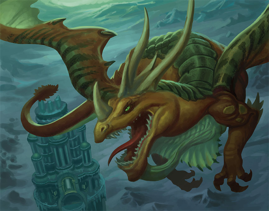
Champion of Time Dragon
This is another painting for the World of Warcraft TCG set Battle of the Aspects. The "Champion of Time" dragon needed to be flying above and circling the tower in the lower left of the picture but he also needed to be the primary focus of the painting. I decided to use a heavily foreshortened pose to solve that problem and then set to work. You can see the initial sketch above. To give you some idea of the various stages a picture like this can go through, here's a step-by-step explanation of how the piece developed from there:
1.) I blocked in basic shapes and a few details. At this stage, I'm always trying to establish the color scheme and the base values rather than worrying too much about details (although the tower is already pretty far along).
2.) Having worked out the color scheme and the basics of the lighting, I plunged ahead with the details. Working on a separate layer in Photoshop, I created the scale pattern on the dragon and added further details elsewhere.
3.) The horns and wings were developed further, as were elements of the background.
4.) The neck looked too pinched and elements of the wings didn't match the Warcraft reference material so those areas were re-worked. I also moved the tail so it didn't overlap the top of the tower (something that should have been done from the start).
5.) I was going for a color scheme unified by the green-yellow light you see diffused throughout the image but the art director thought more contrast (in both value and color) would read better at print size. He was right so I adjusted the image in Photoshop using Levels. I simply set a white point in the bright area of sky at the very top of the picture. That shifted the colors significantly, a little too much for my tastes. I took that adjusted image and placed it on a layer over the original then changed the opacity of the new image to preserve a bit of that unifying green-yellow light I mentioned earlier. That yielded the final art.
6.) This is the what the image looked like after the aforementioned levels adjustment but before I placed it on a transparent layer over the original artwork.
If you read all of the above… thanks for your time and attention!
Sunday, August 5, 2012
Goblin Priestess
This green-skinned cutie is from the latest World of Warcraft TCG release, Battle of the Aspects. She may also be my personal favorite of the WOW TCG illustrations I've created. I did a similar piece of a gnome priestess that you can find elsewhere on this blog under the name Holy Blaze. I was very happy that painting but I feel the gesture, facial expression, color scheme, etc. all came together better in this one.
I've included the preliminary drawing as well. Note the number of fingers on the goblin's hands. Warcraft goblins have a thumb and three fingers, not four so that had to be changed in the painting.
Monday, July 30, 2012
Ghost Kraken
The actual title of this piece is Grasp of Thalarkis and it was painted as the cover to Dungeon #203 (to illustrate an article with the same name as the picture). I'll let you figure out who Thalarkis but I don't think that will be difficult.
I've always wanted to do a cover to either Dungeon or Dragon magazine. The magazines are e-zines now but a cover is still a unique challenge, a chance to stretch out, work in a vertical format and (sometimes) do a more complex picture. However, when I received the art description for this one, I knew I was looking at a real challenge. I was to illustrate a wizard with a glowing wand and a frightened expression his face being dragged down toward a shipwreck by a Kraken. Okay, that sounded cool but difficult but throw in that the kraken is a ghost and it became truly difficult. I made it even more difficult by forgetting that little fact as I was composing the picture and visualizing the color scheme.
One of the difficulties in painting an underwater scene is that it can easily become too monochromatic. The Kraken in the Dungeons & Dragons world is a yellow-green color and after composing this piece, I forgot that the Kraken was supposed to be ghostly so as I was visualizing the color scheme, I was thinking I'd have that yellow to keep the image from becoming too monochromatic. I was also conveniently forgetting that the kraken would actually have to be at least partially transparent (since it was a ghost).
When working digitally, I usually jump right in and paint in color but the requirements of this piece led me to work it out in black and white first. I started by roughing in the values and beginning to refine shapes in gray, eventually working up a complete value study so that I could make sure the picture read well. From there, I gradually added color, slowly building it up on layers in Photoshop until the picture was completed. I rarely work this way on the computer (although I almost always do a value study first when working in acrylic) but it definitely has it's benefits and I've used the approach a few times since. It's nice to solve problems in gray before applying color although I find it less instinctive and more difficult to build color using this method. In the end, it's another useful 'tool" to have in the tool belt.
I was happy with the way the picture turned out and so were the kind folks at Wizards of the Coast so I hope you like it too. In addition to the final painting, I've attached my initial rough, the preliminary drawing, the first gray study and the final gray value painting.
Sunday, July 22, 2012
Castles
The first piece is a watercolor created for the The Practical Guide to Fairies. The Grig watercolor I posted last month appeared in the same book. This picture depicts a small, underwater sandcastle, a place where small aquatic faerie folk dwell.
The second piece is a pencil drawing of a castle I did a few years ago for a Swedish company called Riotminds.
For those interested in such details: the watercolor was painted on Arches hot press watercolor paper and the pencil drawing was simply drawn with an ebony pencil on Strathmore drawing paper.
Sunday, July 15, 2012
Goblin Brigand
This piece was painted several years ago for a Magic the Gathering project that never quite materialized. It's been waiting for a home ever since and was finally published as a goblin token this year. Consequently, I can actually show it!
The scene was painted in acrylics on watercolor paper. I challenged myself to see if I could pull off a warm, golden yellow background and was happy with the results. Yellow can be a difficult color to work with because it's so warm and bright, it wants to come forward. That means it only works as a background color if you get the values (shades of light and dark) in a painting right. I'd like to think I did that in this illustration and I had a great time painting the various leather and stone textures too (not to mention the goblin himself).
Images on Magic the Gathering token cards are placed in a vertical oval (do a search for M13 Goblin Token and you'll see what I mean) so the only part of this painting you can really see in print is the goblin character itself. Fortunately, thanks to the miracle of modern blogging, you can see the entire piece here!
Spurious Sarcophagus
I'm back from an unforeseen break! My apologies for the disappearing act. Work and life demanded it. To make up for it, I'll be posting double the fun today. The first piece up is called Spurious Sarcophagus. It was painted for a World of Warcraft loot card. My understanding is that, in the game, the sarcophagus is full-size, large enough for someone to lie down in. However, for the card, I was asked to paint it more like a pendant.
I love ancient egyptian art so painting an item that was clearly inspired by that tradition was right up my alley. I was very pleased with the way this turned out, especially the contrast between the sarcophagus and the background.
Subscribe to:
Posts (Atom)


.jpg)