Tuesday, August 1, 2017
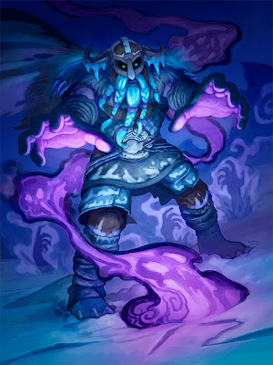
Hearthstone: Corpse Raiser
Here's another new Hearthstone illustration, painted for the Knights of the Frozen Throne expansion.
I've included step-by-step process images below, beginning with my preliminary drawing.
Steps 1 and 2:
Sometimes the process for creating an image is pretty straightforward but there are times when a painting goes through a considerable transformation from start to finish. That was the case with this one. As usual, I began with a drawing, pictured below. I knew I would be dealing with complex lighting on this piece so my next step was to focus on value and I began building the picture in gray tones. Since I was painting a necromancer casting a corpse-raising spell, I wanted the piece to be dark and moody.
Step 3: After establishing some of the value structure, I began applying color on layers (I should mention that all of this work was painted digitally, in Photoshop).
Step 4: The drawing was superimposed over the painting and I started working out some more details, separating forms, etc.
Step 5: More details were added. Forms were refined and I continued pushing value and contrast.
Step 6: The figure was more or less completed and the values established. However, my initial plan of creating a dark, moody piece with a focus on the necromantic spell had gone a bit awry. The picture was too dark for it's intended purpose (card images are small and usually need more contrast) and I was gently reminded by art director Jeremy Cranford that this image wasn't for a spell card so there should be more focus on the character than the spell. That sound advice led to...
Step 7: In which, working on layers (including some Screen and Lighten layers), I seriously re-worked the values and adjusted the lighting to make it a brighter scene. The hands bursting up in the background had become a compositional distraction so landscape elements were painted over them. I was asked to add some spell energy coming from the necromancer's hands so that changed the lighting too. I tried to subtly work more color into the piece and push the focus upward, to the character's face and hands. This stage led to the final art, which you can see at the top of this post.
It was quite a journey, more involved than usual, but I was happy with the final results and, as always, when painting, I learned a few things along the way.
Subscribe to:
Post Comments (Atom)


No comments:
Post a Comment