Tuesday, August 1, 2017
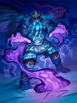
Hearthstone: Corpse Raiser
Here's another new Hearthstone illustration, painted for the Knights of the Frozen Throne expansion.
I've included step-by-step process images below, beginning with my preliminary drawing.
Steps 1 and 2:
Sometimes the process for creating an image is pretty straightforward but there are times when a painting goes through a considerable transformation from start to finish. That was the case with this one. As usual, I began with a drawing, pictured below. I knew I would be dealing with complex lighting on this piece so my next step was to focus on value and I began building the picture in gray tones. Since I was painting a necromancer casting a corpse-raising spell, I wanted the piece to be dark and moody.
Step 3: After establishing some of the value structure, I began applying color on layers (I should mention that all of this work was painted digitally, in Photoshop).
Step 4: The drawing was superimposed over the painting and I started working out some more details, separating forms, etc.
Step 5: More details were added. Forms were refined and I continued pushing value and contrast.
Step 6: The figure was more or less completed and the values established. However, my initial plan of creating a dark, moody piece with a focus on the necromantic spell had gone a bit awry. The picture was too dark for it's intended purpose (card images are small and usually need more contrast) and I was gently reminded by art director Jeremy Cranford that this image wasn't for a spell card so there should be more focus on the character than the spell. That sound advice led to...
Step 7: In which, working on layers (including some Screen and Lighten layers), I seriously re-worked the values and adjusted the lighting to make it a brighter scene. The hands bursting up in the background had become a compositional distraction so landscape elements were painted over them. I was asked to add some spell energy coming from the necromancer's hands so that changed the lighting too. I tried to subtly work more color into the piece and push the focus upward, to the character's face and hands. This stage led to the final art, which you can see at the top of this post.
It was quite a journey, more involved than usual, but I was happy with the final results and, as always, when painting, I learned a few things along the way.
Tuesday, August 9, 2016
Hearthstone: Protect the King!
Here's another illustration for the new Hearthstone release One Night in Karazhan. This one was a real challenge. I needed to depict chess pieces with no legs in motion. Eventually, I needed to work magical energy into the picture without creating chaos. Both the composition and the color scheme went through some big changes.
As you can see below, the original composition was more expansive, showing more of the pieces on the board. A decision was made to zoom in on a section of the composition so it would read better at the size of a Hearthstone card. From there, I did a complete value study in black and white to clarify the picture before adding color. I rather like the image this way, with black and white pieces actually painted in black and white. I wanted to preserve some of that feel so my initial approach to the color scheme was to use analogous colors (colors next to each other on the color wheel—in this case, blues and purples).
Ultimately, the final art had to be much more colorful than that and I needed to work in magical energy so the pieces became a warm purple and ochre and I introduced red and blue energy. I think it works and in the end, I have a nice example of just how much color can change a piece even after most of the values have been established.
Sunday, June 12, 2016
Smash Hit: Process
As you can see, I also added a texture over the ground using a transparent layer.
3.) More development: At this stage, I had begun working on the girders in the background and I shifted the color of the cement-slinging vehicle from orange to a bright red. Most of the work was done with the Hard Round brush in Photoshop, or with a brush named "Airbrush Pen Opacity Flow".
4.) The color of the girders in the background was changed from red to a cool blue to push them back and keep them from competing for attention with the foreground elements. Texture and detail were added to the vehicle.
5.) Next, I began developing the character by adding details and refining shapes. I also did a bit more work on the background.
6.) Having completed the central elements of the picture, I refined and developed the rest of the background (and the actual ground) and the picture was finished...
7.) ... or so I thought! It turned out that the girders weren't an appropriate element for the game setting so they had to be removed. They were replaced with more clouds and stacked bricks and then the picture was truly finished.
I actually prefer the version in step 6. I think the strong vertical lines of the girders really added something valuable to the composition but hopefully, both versions of the picture are successful.
Questions are welcome!
Friday, November 13, 2015
Earthen Statue
Here's one more illustration (and one more statue) painted for Hearthstone: League of Explorers. I've included more process imagery this time because I thought the process behind this one might interest a few of you.
As you can see below, I began, as usual, with a line drawing. From there I began blocking in values, in gray, and building up the picture, all while knowing I intended to throw a spotlight onto the statue in the foreground and blur the partially carved statues in the background.
I began adding color and light, going with a very warm, yellow and brown color scheme. It's not a color scheme I use often and I thought it would be a challenge that would also suit the picture. At this stage, Art Director Jeremy Cranford helpfully suggested softening the rays of light so they weren't so distinct from one another (that helped the picture tremendously), adding some motes of dust (another good idea) and creating more color contrast by adding more cool color. That warm/cool contrast can really help a picture pop on a card.
Those suggestions led to the blue and gold version you see at the bottom of this post and, ultimately, to the final art you see above, which pushes the contrast between warm and cool colors even further. I'm still not sure which of these last two versions I prefer but I think the final art reads best in the Hearthstone card format.
Some pictures require the artist to go on a longer journey than others! I hope some of you find this info about the process behind this one interesting. If you have any questions, please don't hesitate to contact me.
Friday, May 8, 2015
On the Shoulder of a Giant part 6
This is the last spread I'll be posting this week from On the Shoulder of a Giant. It's also the last spread in the book and it shows Inukpak and the hunter roaming the arctic landscape in the winter. However, I'll share a few smaller images from the book tomorrow so please, stay tuned!
As I worked on this spread, I found myself continually painting details out of the picture, trying to make it work as a design as much as a rendered illustration. It's something I've been more focused on in recent years and I want to continue focusing on it.
I'm including two preliminary sketches this time. I added simple gray tones to one of them before painting the final. That was actually part of the process on all of these spreads. It was very helpful,
-------------------------
On the Shoulder of a Giant is available on Amazon.com and at Barnes and Noble. Please pick up a copy and write a review. You can post about it on Goodreads too.
You can find the publisher, Inhabit Media on the web at http://inhabitmedia.com
Sunday, November 23, 2014
Hearthstone: Cobalt Guardian
The working title for this piece was "Protector Robot" and it was sort of a dream assignment for me. I've been designing robots for a couple of years now, mainly as vector art. It's become a passion of mine, so when I was given the opportunity to design a robot for the game Hearthstone, I was thrilled. This 'bot needed to look like it belonged in the World of Warcraft universe (and as if it was built by gnomes) but beyond that, designing it was basically up to me. I'm very pleased with the way it turned out.
I've posted some process images along with the final art. The entire picture was done in Adobe Photoshop. I began with a simple line drawing, then painted a complete value study in gray. From there, using color, overlay and multiply layers, I began adding color to the grayscale image. I made additional adjustments along the way, painting into areas that needed it, pushing the value range and making the color stronger, until I ended up with a finished image that just need the final protective energy shield the robot is projecting. I initially chose a shade of blue for that as I felt it harmonized with the color scheme better. I still lean toward that color choice for purely personal reasons but the shield is painted in warm colors on the final art, to create greater contrast between it and the cool colors in the rest of the picture.
If you'd like to see some of the robot designs I mentioned above, they are all on display at: http://robotspot.tumblr.com/
Monday, November 10, 2014
Hearthstone: Shrinkmeister
Sunday, November 4, 2012
Mind Flayers

This Photoshop painting of a pair of Mind-Flayers leading a hypnotized drow (basically a dark-skinned elf for those who don't know) down a hallway was a real challenge so I thought I'd share the process. I won't go into too much detail describing it since I think the images speak for themselves. I began with a line drawing (not included here but typical of the preliminary line drawings I've posted with other paintings). I then painted the figures and the basics of the surroundings in gray, using basic Photoshop brushes. I began adding color, texture and detail, making changes as the picture progressed. The textures were created by pasting texture images over the painting, adjusting the transparency and distorting the texture image to match the perspective. Further texture was added using custom brushes. As you can see, my initial instinct to use an intense gold backlighting gave way to a much more muted choice. The wall relief was loaded into the painting from the preliminary drawing and If I remember correctly, I simply made a Levels adjustment to to darken the colors where the line drawing was loaded. I then painted back into the walls, to finish the piece off.
I've included a detail of the characters. I hope you enjoy the piece and I hope all of this is enlightening!
Sunday, May 15, 2011
Nature's Fury Process Part 2
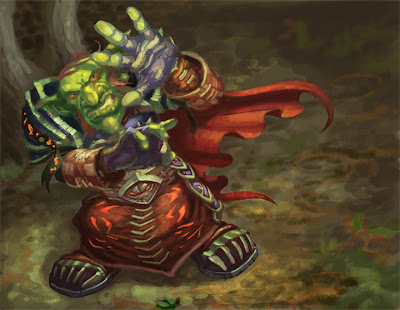
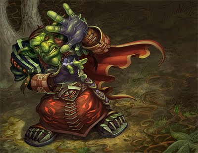
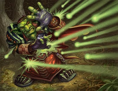
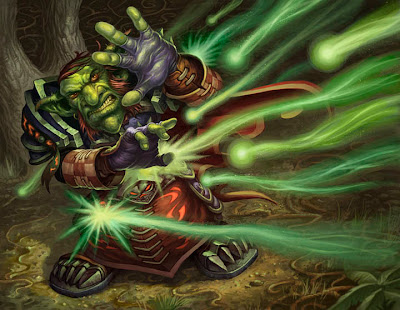
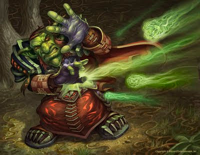
When working on a traditional painting, once I've completed the drawing, I transfer it to watercolor paper (or some other surface) and do a monochromatic underpainting, usually in raw umber. I occasionally begin a digital painting with a monochromatic value study as an "underpainting" too but more often than not, I just plunge straight into color.
Step 4: I place the final drawing in a Photoshop channel in a new RGB file and make that channel visible at an opacity of about 70%. Then I begin painting. This approach enables me to see the drawing as I'm blocking in color.
I start with a base color as my background. In this case it was a light brown. Sometimes I add a texture over that color just to give myself a little more than flat color to work over. Using Photoshop's standard hard round brush and a custom variation or two, I begin adding color, modeling forms, etc., using the drawing in the channel as a guide. This stage is the equivalent of glazing color over a drawing or underpainting on a traditional piece.
Step 5: Once I have the basic colors and values established, I copy what I've just painted to a new layer, load the aforementioned line drawing channel as a selection, invert that selection, and delete. I then change the layer's mode to Multiply. This gives me a dark version of the line drawing on top of the colors I've painted. The lines are darker versions of the color lying beneath them. This step may sound technical to those not familiar with Photoshop but trust me, it's very simple.
I erase some of the linework on the multiply layer completely and reduce the opacity of other areas. Then I drop the multiply layer down onto the color layer, re-save the file and take it from Photoshop into Corel Painter. There, using a variety of brushes, I begin refining forms, adding texture and covering the lines (which are only there to serve as a guide and tighten up a few areas for me). In the second image above, the goblin has largely been finished while the line can still be seen in parts of the background.
Step 6: The painting goes back into Photoshop for more refining, primarily using the default hard round brush. The raining energy effects were added on a layer and I also added some spatter by pasting a scan of spattered ink into a channel, loading it as a selection and painting into the that selection wherever I wanted spatter to appear.
Steps 7 and 8: The raining energy ended up looking too regular and mechanical so I repainted it, varying the colors, light trails, etc. This still wasn't quite right so I took a third shot at it, cutting back on the number of energy trails and painting the "projectiles' as something akin to green fireballs. As you can see from the examples above, the flexibility to make changes like this is one of the great advantages to painting digitally. I was able to keep the raining energy on a different layer than the figure and background and consequently, I could change it as often as I liked without effecting the rest of the picture.
I hope that's not too much information in one post and that some of you find this kind of process talk useful and informative!


