Saturday, May 28, 2011

Octorilla and the Reluctant Beast


Things are a bit crazy here at Casa Jim right now, as I plunge ahead on various deadlines. Consequently, I'm continuing with this week's theme of posting Dreamblade miniature drawings. A lot of this work hasn't seen the light of day except as tiny drawings printed on cards and, of course, in the form of the final sculpted miniatures. I hope people enjoy seeing it.

The first of these two drawings shows a creature called (for obvious reasons) an Octorilla.

The second is called Reluctant Beast. The idea was to design a formidable monster that's downright timid and cowardly. His pose and posture needed to reflect that so I tried to reinforce it with everything from a tightly curled tail to "puppy dog" eyes. It was really fun to work on something like this that goes against type.

Tuesday, May 24, 2011

More Dreamblade


Here are a couple more miniature turnarounds I did for Dreamblade. I certainly miss working on this game! It always presented new and unusual challenges. The Hungry Ghost miniature design, pictured above, is an excellent example of the kind of challenges Dreamblade provided. In Tibetan Buddhism, hungry ghosts serve as a metaphor for people's attempts to attain their physical desires. Some are said to have "mouths the size of a needle's eye and a stomach the size of a mountain". That's a striking image and a concept I needed to capture as a figure that could be cast in plastic! I had a great time figuring out how to accomplish that and the design I ended up with is one of my favorites.

The second image above is a friendly monster, a creature that was supposed to be part building/statue and part monster. I drew on Maurice Sendak's monsters for inspiration and tried to capture the spirit of the monsters he drew in "Where the Wild Things Are" without simply aping his designs. Hopefully, I succeeded. Unfortunately, I don't think this miniature was ever produced.

Sunday, May 22, 2011

Dreamblade Monster


Several years ago, I found myself doing a lot of "turnaround" designs for miniature figures (to be used, of course, in tabletop miniatures games). I hadn't done much of that sort of work before but I found I had a knack for it and really enjoyed it. One of the games I worked on was Dreamblade, a somewhat surreal game that involved warring factions of dream creatures that fell into categories like Valor, Fear, Madness and Passion. Today's drawing fell into the Madness category. My assignment was to create a creature whose head consisted of two crocodile heads combined, sideways. It's a cool idea and I ran with it, envisioning the monster as a sort of kaiju (a Japanese word meaning "strange beast"), something along the lines of movie monsters like Godzilla or Gamera. Because it belonged to the Madness faction, it's body contains some (hopefully) unsettling characteristics.

Thursday, May 19, 2011

Stone Beholder


This digital painting was created for Dragon magazine and depicts one of the most popular Dungeon and Dragons creatures, a beholder. Beholders are a blast to draw and paint because they're basically a big eyeball with teeth and tentacles. I've had the pleasure of painting several of them over the years. This fellow has been turned to stone, fell, and is lying in a cave, broken and gradually calcifying.


Sunday, May 15, 2011

Nature's Fury Process Part 2


When working on a traditional painting, once I've completed the drawing, I transfer it to watercolor paper (or some other surface) and do a monochromatic underpainting, usually in raw umber. I occasionally begin a digital painting with a monochromatic value study as an "underpainting" too but more often than not, I just plunge straight into color.


Step 4: I place the final drawing in a Photoshop channel in a new RGB file and make that channel visible at an opacity of about 70%. Then I begin painting. This approach enables me to see the drawing as I'm blocking in color.


I start with a base color as my background. In this case it was a light brown. Sometimes I add a texture over that color just to give myself a little more than flat color to work over. Using Photoshop's standard hard round brush and a custom variation or two, I begin adding color, modeling forms, etc., using the drawing in the channel as a guide. This stage is the equivalent of glazing color over a drawing or underpainting on a traditional piece.


Step 5: Once I have the basic colors and values established, I copy what I've just painted to a new layer, load the aforementioned line drawing channel as a selection, invert that selection, and delete. I then change the layer's mode to Multiply. This gives me a dark version of the line drawing on top of the colors I've painted. The lines are darker versions of the color lying beneath them. This step may sound technical to those not familiar with Photoshop but trust me, it's very simple.


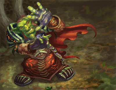
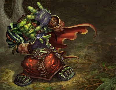
I erase some of the linework on the multiply layer completely and reduce the opacity of other areas. Then I drop the multiply layer down onto the color layer, re-save the file and take it from Photoshop into Corel Painter. There, using a variety of brushes, I begin refining forms, adding texture and covering the lines (which are only there to serve as a guide and tighten up a few areas for me). In the second image above, the goblin has largely been finished while the line can still be seen in parts of the background.


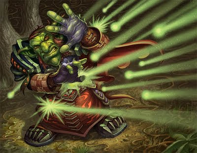
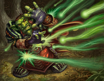
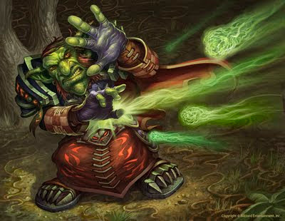
Step 6: The painting goes back into Photoshop for more refining, primarily using the default hard round brush. The raining energy effects were added on a layer and I also added some spatter by pasting a scan of spattered ink into a channel, loading it as a selection and painting into the that selection wherever I wanted spatter to appear.


Steps 7 and 8: The raining energy ended up looking too regular and mechanical so I repainted it, varying the colors, light trails, etc. This still wasn't quite right so I took a third shot at it, cutting back on the number of energy trails and painting the "projectiles' as something akin to green fireballs. As you can see from the examples above, the flexibility to make changes like this is one of the great advantages to painting digitally. I was able to keep the raining energy on a different layer than the figure and background and consequently, I could change it as often as I liked without effecting the rest of the picture.


I hope that's not too much information in one post and that some of you find this kind of process talk useful and informative!

Friday, May 13, 2011

Nature's Fury Process Part 1


One of the things I want to do with this blog is provide some insight into my working process. I don't create every picture the same way but over the last few years, as I've done more and more digital painting, I've developed a slightly different approach to work. I used to do all of my sketching with pencil and paper and although I still do some of that, I often find myself working with screen-res reference and I've found it's easier to use that reference if I just draw on the computer.


Step 1: As always, I begin every piece by sketching. In this case, the subject was a goblin being bombarded with magical energy. Initially, I pictured that energy as a rain of magical "meteors" so I roughed out poses that involved the goblin shielding his head with his hands. You can see a few of these roughs above. At this stage, I just work with a "hard" brush in Photoshop so I can get the equivalent of an ink line.


Step 2: I changed my mind after the initial roughs and decided to show more of the goblin's face. I worked out a pose where the character is looking up and raising his hands to shield himself rather than covering his head. Once I was happy with the pose, I did a "clean" drawing of the goblin wearing his robes and armor.


These drawings were executed in Photoshop channels. The channel containing the rough was set at a low opacity (25-30%) while the channel in which I was drawing the clean version was set at 65-70% opacity. This method is the digital equivalent of working on tracing paper and I use it all the time.


Step 3: I added a background and some bolts of energy to create the final drawing. This drawing was sent to the art director for approval and, once approved, served as the basis for the painting.


In my next post, I'll describe the painting process!

Wednesday, May 11, 2011

More Hammerfast


I'm immersed in an assignment right now (painting some beings from Japanese mythology) so here are a couple more character drawings from the aforementioned Hammerfast project.

Saturday, May 7, 2011

Free Comic Book Day

I don't intend to use my blog as a promotional platform often but I love comics. The art in comics inspired me to become an artist so I like to encourage people to check out one of my favorite storytelling mediums. On that note...


Today is Free Comic Book Day! On the first Saturday of May each year participating comic book shops across North America and around the world give away comic books absolutely free to anyone who comes into their stores. You can't get any comic you want, of course, but there's a wide selection of free comics available and some stores have guest artists, writers, people dressed as comic book characters, etc. It's a fun event so please, find a participating comic shop in your area and get some free comics! There are comics for kids, comics for adults and comics covering a wide variety of subject matter so there's something for everybody. Today is a good day to give comics a chance.


While you're at your local comic shop, please do some browsing and support the store with a purchase as well.


You can check out the free comics available today at http://www.freecomicbookday.com/


Have fun!

Thursday, May 5, 2011

Hammerfast


Back in the Fall of 2009 I had a rare opportunity to do some pen and ink drawings for a Dungeons and Dragons project called Hammerfast. I was in the midst of preparing for a trip to Paris when I began the assignment and I couldn't finish before I left so I took approved sketches with me, refined them and prepared them to be inked while I was in France. I inked them as soon as I returned home so I could get them in to a very understanding art director. None of that has much to do with the final drawings themselves but my illustrations for Hammerfast will always be linked with that trip in my mind.

The two drawings posted above are from the Hammerfast project. They depict a dwarven ghost, a dead sentinel roaming the walls of a city and a three-headed dragon named Calastryx.

Monday, May 2, 2011

Bye-bye Website

Daydream Graphics, where my website has been hosted, closed down today. After 15 years, it's founder, artist Randy Gallegos, decided it was time to shut down his internet artist's collective and focus on other things. Consequently, my website, jimnelsonart.com, will be down for a while too as I work on re-formatting it. However, this blog will be updated with news, art, etc. so please keep checking in.

Many thanks to Randy for his help over the years! You'll find a link to his blog on the right side of this page. Please pay it a visit and check out his wonderful work.

Sunday, May 1, 2011

Tempest Totem and Kickback 5000


Here are two more paintings for the War of the Elements set for World of Warcraft. A gun and a totem might not seem as exciting as a drake attacking a dragon but one of the challenges of illustration is to try making everything interesting. Consequently, I look for what I find visually exciting about a subject and emphasize that. In the case of the gun (the Kickback 5000), I chose to focus on the metallic and wood textures and push the highlights. In the second piece (the Tempest Totem), I focused on dramatic lighting and used elements like the swirl of bubbles and the surrounding sea life to create motion in the composition and to keep the eye returning to the totem.

Keeping the eye focused where you want it focus is always a challenge. For example, the Kickback 5000 painting is set in an environment dominated by warm colors and lit by lava and magma. Warm colors tend to come forward and cool colors recede so one of the biggest challenges in this piece was to make sure the warm background didn't overwhelm the gun. The solution was to keep the values in the background muted and have much stronger highlights in the foreground. As a friend of mine says, value trumps color!