Sunday, November 25, 2012
Character Illustrations
Here are a pair of bards, a dwarf and an elf created for Paizo Publishing's recently released NPC Codex (for those unfamiliar with roleplaying game lingo, an NPC is a "non-player character"). I painted two dwarves and two elves for this project. I'll post them in pairs, along with the drawings.
I actually prefer the preliminary line drawings for these characters to the painted finals. Looking back, it would have been nice to do these in pen and ink and watercolor as opposed to the all-digital I approach I took to the drawings and paintings. Nevertheless, I like the final artwork and I hope readers and players of Paizo's Pathfinder game will like it too. The NPC Codex book itself is simply loaded with artwork and is well worth checking out.
Sunday, November 4, 2012
Mind Flayers

This Photoshop painting of a pair of Mind-Flayers leading a hypnotized drow (basically a dark-skinned elf for those who don't know) down a hallway was a real challenge so I thought I'd share the process. I won't go into too much detail describing it since I think the images speak for themselves. I began with a line drawing (not included here but typical of the preliminary line drawings I've posted with other paintings). I then painted the figures and the basics of the surroundings in gray, using basic Photoshop brushes. I began adding color, texture and detail, making changes as the picture progressed. The textures were created by pasting texture images over the painting, adjusting the transparency and distorting the texture image to match the perspective. Further texture was added using custom brushes. As you can see, my initial instinct to use an intense gold backlighting gave way to a much more muted choice. The wall relief was loaded into the painting from the preliminary drawing and If I remember correctly, I simply made a Levels adjustment to to darken the colors where the line drawing was loaded. I then painted back into the walls, to finish the piece off.
I've included a detail of the characters. I hope you enjoy the piece and I hope all of this is enlightening!
Sunday, October 28, 2012
Orc Death Knight
This is a third card for the World of Warcraft TCG set, War of the Ancients. The title and image should be self-explanatory so I'll talk briefly about technique. As I've mentioned before, I sometimes find it useful to paint an image purely in value, in tones of gray, so that I can focus on light and shadow first without worrying about color. That's the approach I took with this one, going from sketch to black and white "underpainting" to full color. The entire piece was created in Adobe Photoshop and for those who need to know such things, the color was added gradually, on layers, using several different layer modes (primarily overlay, color, saturation and normal mode).
Sunday, October 21, 2012
Tauren Timewalker
Here's another card painting (created in Adobe Photoshop) from the recently release War of the Ancients set for World of Warcraft. It depicts a Tauren warrior, guarding a location called The Caverns of Time. Like the previous post, it's another relatively warm painting with a bright, hot color in the background. That pink hue worked well as edge lighting for the Tauren character.
This was one of those illustrations that just flowed out almost effortlessly. Sometimes a painting can be a real struggle from start to finish, involving a lot of tweaking and re-painting. This one went smoothly from start to finish... a rare treat!
Sunday, October 14, 2012
Cho'gall
It's been a while since I've had new work I could post so I apologize for the long delay between updates. I've been "in the weeds", working on new projects, none of which can be shared publicly yet. Eventually, that should mean I have plenty to share with you. Meanwhile, I'll do my best to get back on a weekly update schedule.
The handsome fellow above is an ogre named Cho'gall. He was painted (digitally) for the World of Warcraft trading card game. I love painting big, ugly characters like this guy. The lighting was a challenge but I think it works and I gave myself an extra challenge (to go with Cho'gall's extra head) by using red as the sky color. Warm colors like red tend to come forward and cool colors tend to be recede so it's fun to try making a warm red serve as a background color once in a while.
Sunday, August 19, 2012
Swordwing
I wanted to nail down the lighting and structure in this picture before adding color so I did a full value study in gray and then gradually added color over that until the piece was completed. The color was added using various layer modes in Photoshop (color, overlay and soft light, to be specific). I actually think the piece is a bit moodier in black and white but I'm pleased with the color version as well.
Tuesday, August 14, 2012
Champion of Time Dragon
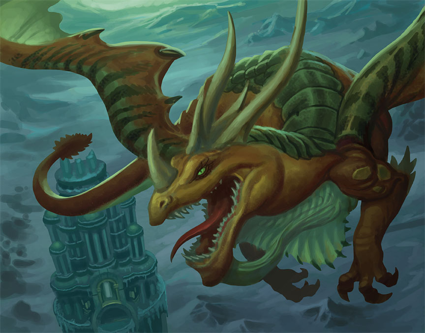
This is another painting for the World of Warcraft TCG set Battle of the Aspects. The "Champion of Time" dragon needed to be flying above and circling the tower in the lower left of the picture but he also needed to be the primary focus of the painting. I decided to use a heavily foreshortened pose to solve that problem and then set to work. You can see the initial sketch above. To give you some idea of the various stages a picture like this can go through, here's a step-by-step explanation of how the piece developed from there:
1.) I blocked in basic shapes and a few details. At this stage, I'm always trying to establish the color scheme and the base values rather than worrying too much about details (although the tower is already pretty far along).
2.) Having worked out the color scheme and the basics of the lighting, I plunged ahead with the details. Working on a separate layer in Photoshop, I created the scale pattern on the dragon and added further details elsewhere.
3.) The horns and wings were developed further, as were elements of the background.
4.) The neck looked too pinched and elements of the wings didn't match the Warcraft reference material so those areas were re-worked. I also moved the tail so it didn't overlap the top of the tower (something that should have been done from the start).
5.) I was going for a color scheme unified by the green-yellow light you see diffused throughout the image but the art director thought more contrast (in both value and color) would read better at print size. He was right so I adjusted the image in Photoshop using Levels. I simply set a white point in the bright area of sky at the very top of the picture. That shifted the colors significantly, a little too much for my tastes. I took that adjusted image and placed it on a layer over the original then changed the opacity of the new image to preserve a bit of that unifying green-yellow light I mentioned earlier. That yielded the final art.
6.) This is the what the image looked like after the aforementioned levels adjustment but before I placed it on a transparent layer over the original artwork.
If you read all of the above… thanks for your time and attention!
Subscribe to:
Posts (Atom)